How to display equipotential lines for a 2D problem

Hello,

As a new user of NGSolve, I’m playing with a 2D magnetostatics tutorial (alternative link: JupyterLite version) by @tcherrie which runs fine, but I’d like to get extra visualizations of the result.

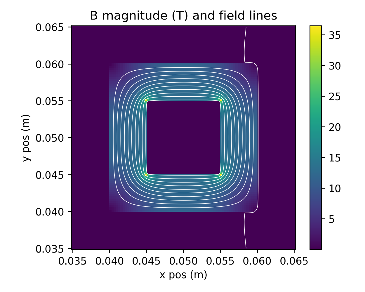
In particular, I’d like to plot the field lines of the B magnetic field. I’ve adapted from the last part of the Coil tutorial which gives me this code and the following result:

from ngsolve.webgui import FieldLines

fieldlines = FieldLines(B, mesh.Materials(".*"), length=1, num_lines=20)

Draw(B, mesh, objects=[fieldlines],
     min=0, max=1e-4,
     settings={"Objects": {"Surface": False}}
    );

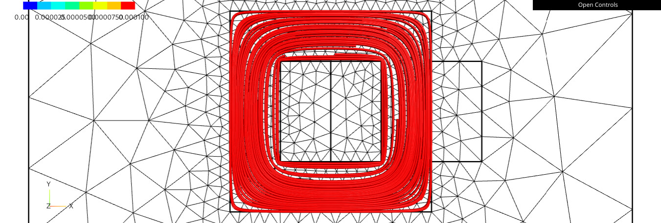
which looks somehow what I’d like, but this could be improved. In particular:

  • aspect: have 2D lines rather than 3D tubes
  • get control over color (here I understand that the red color comes from the cropped colormap with max=1e-4 while most of the B field is above this level)
  • random placement: better have an “isodensity” placement (not sure what the proper term is)
  • closing the field lines requires using an “large” value for the length parameter

Or said simpler, I’d like to get the field line plot of FEMM:

.

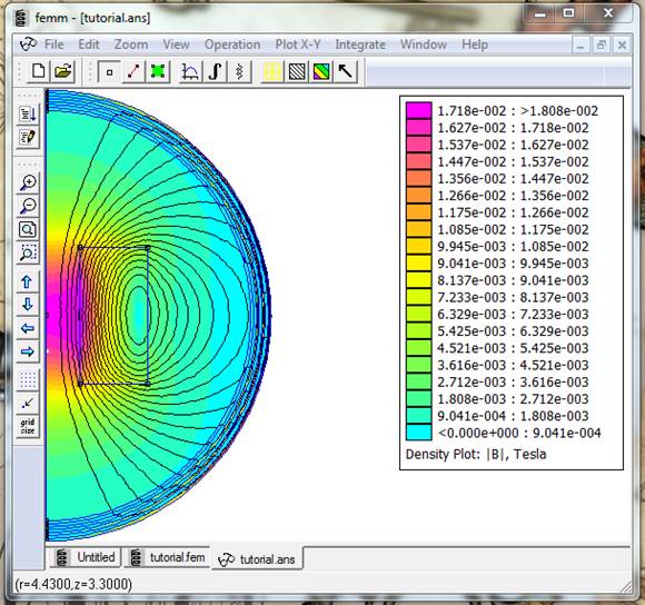
For this, I kind of understand that the trick is not to plot the field lines of B but instead the equipotential lines of the magnetic potential A, Correct? However, I didn’t find in the doc an information on how to draw equipotentials (I understand that in 3D they are surfaces but in 2D they are lines, correct?).

An alternative would be to make the plot with another tool like Matplotlib’s contour plot function. For this, I’d need to export the A field value over a an x-y grid (which I have not yet searched how to do).

What option seems better: webgui or external tool?

Dear Pierre,

In 2D planar magnetostatics, you are correct: the field lines are actually the isolines of the z-component of the magnetic vector potential. Note that for an axisymmetric simulation like the one in your image, the scalar field is a_theta and must be multiplied by 2πr for the contour to correspond to the flux lines. The formulation of the PDE also needs to be slightly adapted.

In the webgui, I know it’s possible to plot a scalar field and adjust the color scale to make the contour lines visible, but we lose the intensity coloring of B that we have with FEMM. Another approach is to plot B directly with vector arrows, but then the field lines are somehow lost. I don’t know how to represent certain features of two different fields on the same figure (like the contour of A with the surface filling of ​​B, which is what FEMM is probably doing); if you are proficient in JavaScript, it might be possible: Webgui - programming and internal features — NGS-Py 6.2.2604-2-g455d4e659 documentation

I am not skilled enough to help you further with the webgui. Using matplotlib or another external library could be a workaround. You can evaluate a given field at each point of the mesh (see Access GridFunction with Coordinates ), then use the visualization of your choice.
Best,
Théodore

1 Like

If you are experimental / brave, you can also try our new rendering framework:

I just added this feature there (you need to checkout current master)
https://cerbsim.github.io/ngsolve_webgpu/isosurface.html#Isolines

and its also easy to extend from python and write your own renderers / derive from the given ones and change their behaviour.

Disclaimer: This is in early stage and under heavy development - so things and interfaces might change.

Best
Christopher

1 Like

Thanks a lot for the feedback. I was a able to get pretty nice results with approach: eval on a grid and then plot with Matplotlib:

Here are the main steps. The key idea to get values on a 2D grid is to flatten the numpy coordinate arrays:

import numpy as np
import matplotlib.pyplot as plt

# eval on a 2D mesh grid
n = 101
x_lin = np.linspace(0.035, 0.065, n)
y_lin = np.linspace(0.035, 0.065, n)
X, Y = np.meshgrid(x_lin, y_lin)
Xshape = X.shape # save shape
Xf = X.reshape(-1) # flatten
Yf = Y.reshape(-1) # flatten
a_XY = a_gfu(mesh(Xf, Yf))
a_XY = a_XY.reshape(Xshape) # back to 2D
# same for B, but needs to handle the fact it's a vector → compute magnitude
B_XY = B(mesh(Xf, Yf)) # shape (n², 2)
Bnorm_XY = np.sqrt(B_XY[:,0]**2 + B_XY[:,1]**2)
Bnorm_XY = Bnorm_XY.reshape(Xshape) # back to 2D

then here is a plot mixing field lines with B intensity as a colormap

fig, ax = plt.subplots(figsize=(5,4), subplot_kw=dict(aspect='equal'))

im = ax.pcolormesh(X, Y, Bnorm_XY)
fig.colorbar(im, ax=ax)
ax.contour(X, Y, a_XY, levels=10, colors='white', linewidths=0.5) # fix color, otherwise its colored by A

ax.set(
    title = 'B magnitude (T) and field lines',
    xlabel='x pos (m)',
    ylabel='y pos (m)',
)
fig.tight_layout()

Also thanks @christopher for your feedback. I took the “path of least unknown” and kept webgpu for another day!

Hi Pierre, it looks great, thanks for the snippet! :grinning_face:
Also big thanks to @christopher for the feature and reactivity! I’m really interested in future developments of the webgui/webgpu. Making it usable in JupyterLite would be amazing for students and teaching! But this might be an entirely other topic in itself.

Best

Théodore

If its not already working in jupyterlite it should not be a big thing as we already use it within pyodide apps